The Icon
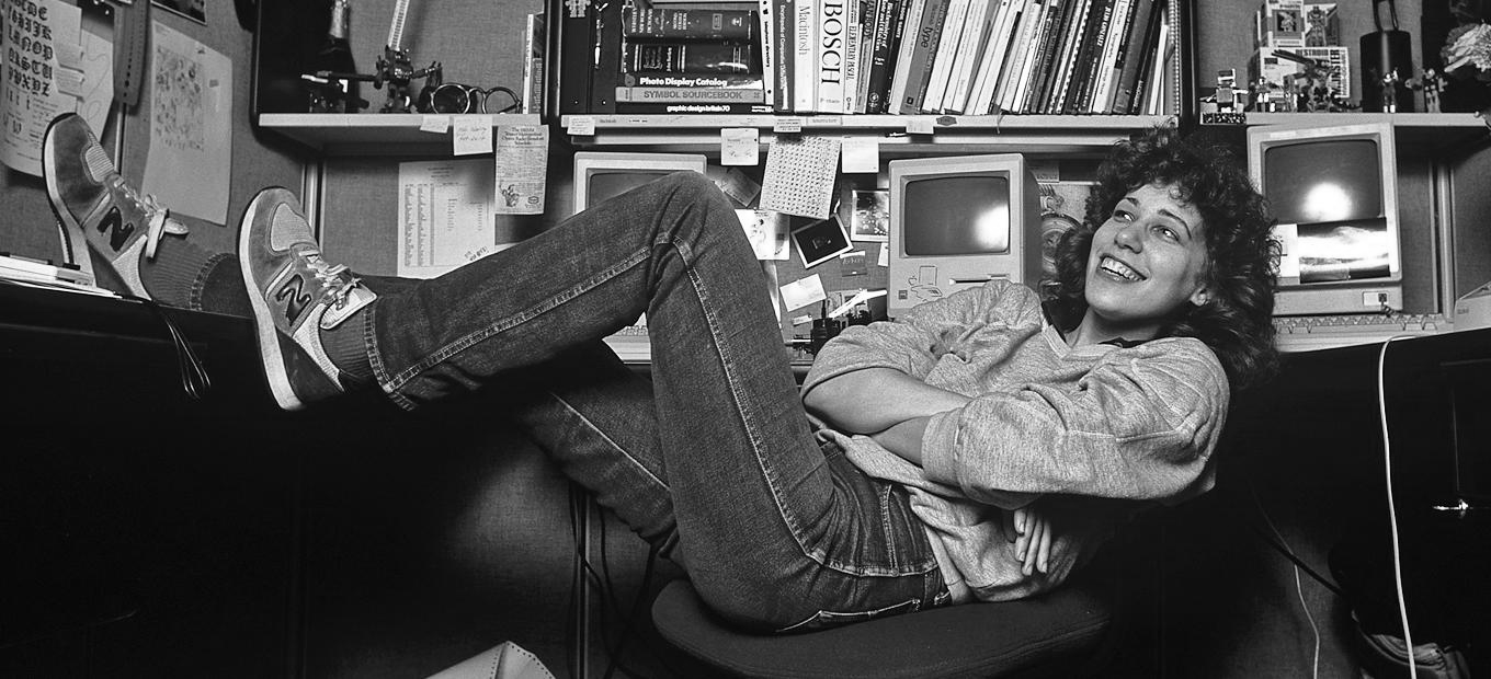
Susan Kare, icon of icons.

Imagine designing the trash can.
The save button. The command key.
WLTM Susan Kare, who did all three.
Kare was a misfit. A fine artist in the world of tech, she was a Picasso in 8-bit. The Mac Matisse. In 1982, a high school pal got her a gig at Apple and, lucky for them, she was a design prodigy. One unfazed by the task of creating art for brand new interfaces, when computers were still an alien concept to most people: obtuse, logical machines. She saw a new medium.
Her first assignment was a typeface. She took inspiration from book lettering, to make Chicago feel natural and familiar. Calling it Elefont was the first sign of how she took her weird humour to a whole heap of type.
For the icons, there was no fixed path, so she experimented; studying hieroglyphs and hobo signs, realising the connections with embroidery and mosaic. That the pixels she picked seem so obvious today is only because they're so thought-through... Imagine 'copy' sticking to its old concept of a photocopier, or a 'copy cat' (wut).
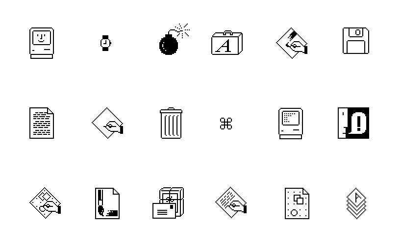
Whimsical in a world of beige boxes, she designed our interactions with machines to feel friendly, recognisable and alive; more like a pet than a thing.
Kare was one designer in a team of engineers, back when there were no set paths to follow, no best practice to speak of. Tech gurus now are plutarchs and superstars; if you're good, we'll make a god of you.
But what makes Kare so appealing is in a world of 'hustle hard', she hustled hard, but never took it too seriously. Undaunted by charting new waters, she realised the best concepts are often born from outsiders, and fucking around. Great craft can have joy and whimsy, be easy and accessible rather than egotistical. Revolutions can be chill.
"The best surfer in the water is the one having the most fun."
Ah, fuck it. Just read this.
.
.
.
image: Susan Kare